6 best design tips for creating a food menu

Designing a professional-looking menu doesn’t require expensive software or a degree in graphic arts. With the rise of intuitive, drag-and-drop design platforms, anyone can create a stunning layout. However, filling a template correctly requires strategy. So, here are some creative tips to help you design a menu that not only looks beautiful but also drives sales.
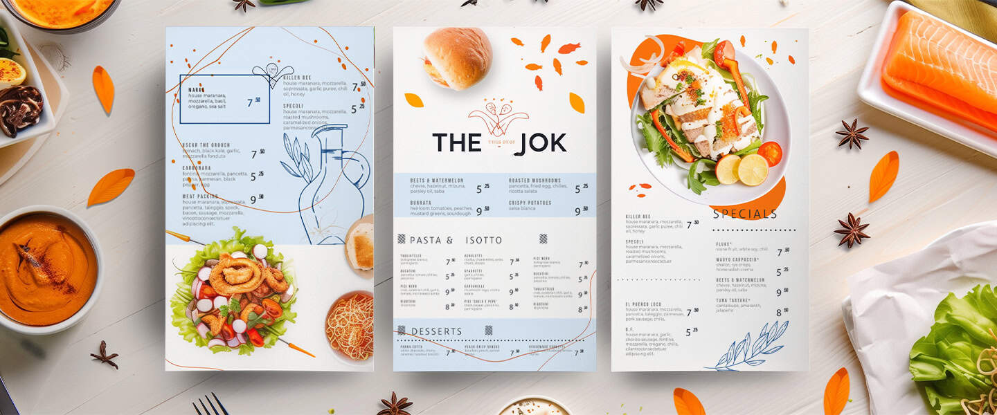
Use mouth-watering food images
Visuals are the quickest way to stimulate an appetite. A high-quality photo of a signature burger or a fresh salad can convince a customer to order a dish they weren’t originally considering. However, the key here is restraint and quality. Do not clutter the design with a photo for every single item, as this can make the menu look cheap and overwhelming. Instead, choose one or two hero images that represent the best of what you offer.
When selecting photos, ensure they are high-resolution and well-lit. If you are using stock photos from a design tool, make sure they closely resemble the actual food you serve to avoid disappointed customers. If you are taking your own photos, use natural light and ensure the colors pop. Feel free to use the One-Click Resize tool on PosterMyWall to make your images fit within your designs. The goal is to create a visual anchor that draws the eye and makes the stomach grumble the moment the menu is opened.
Organize items into clear sections
A confused customer is an unhappy customer. If your menu is a chaotic wall of text, diners will feel overwhelmed and may default to ordering the cheapest or most familiar item just to get the process over with. To prevent decision fatigue, you must organize your offerings into logical, distinct categories such as Appetizers, Mains, Sides, and Desserts.
Use visual dividers to separate these sections. This could be as simple as a bold line, a different background color for a specific block, or utilizing negative space (empty white space) to let the design breathe. Clear headings with a distinct font style help guide the reader’s eye smoothly down the page, allowing them to scan the options quickly and make a confident choice.
Highlight signature dishes
Every restaurant has items that they want to sell more of, either because they are high-profit dishes or because they are unique to the chef. You can use design psychology to subtly influence what the customer chooses by visually highlighting these specific items. This technique is often referred to as menu engineering.
To make a dish pop, place it in a box, use a different colored font, or place a small icon like a star or a chef’s hat next to it. You can also use the Golden Triangle rule, which suggests that customers’ eyes naturally look at the middle, then the top right, and then the top left of the page. Placing your most important dishes in these prime visual real estate spots ensures they get the attention they deserve.
Pick appetizing color schemes
Colors communicate mood and flavor before a single word is read. When customizing your design template, choose a color palette that reflects the type of food you serve. For example, fresh, healthy eateries often benefit from greens and earthy tones, while burger joints and pizzerias often use warm reds, yellows, and oranges because these colors are known to psychologically stimulate appetite.
Avoid colors that are generally considered unappetizing in the context of food, such as neon blues or dull grays, unless they fit a very specific niche brand. The text color should also contrast sharply with the background to ensure readability. If you have a dark background, use white or light cream text; if the background is white, stick to dark charcoal or black for the main text.
Keep descriptions short but tasty
The text on your menu needs to work hard. You have limited space, so every word counts. Avoid long, boring lists of ingredients. Instead, use sensory adjectives that evoke taste, texture, and smell. Words like crispy, zesty, tender, smoky, and house-made trigger a sensory response in the brain.
Keep the descriptions concise and up to around two lines maximum. You want to romance the dish without writing a novel. A good formula is to state the main component, mention the cooking method, and list the key flavors or sauces. This keeps the design clean and ensures the customer spends their time choosing food rather than reading a book.
Display pricing creatively
How you display prices can significantly impact how much customers are willing to spend. A common design trick is to remove the currency symbol (like the dollar sign). Research suggests that seeing a currency symbol reminds people they are spending money, which can trigger the pain of paying. effect. For example, seeing just the number 14 feels less transactional than seeing $14.00.
Additionally, avoid using leader dots (rows of dots connecting the dish name to the price on the far right). This encourages customers to scan down the right side of the page and choose based on the lowest number. Instead, tuck the price at the end of the dish description in a similar font size. This forces the customer to read about the delicious food first and consider the price second. You can use the free menu templates on PosterMyWall to help you with this, and use these templates for the best layouts possible.
By combining strategic layout choices with appetizing visuals and psychology-based pricing, you can turn a simple sheet of paper into a sales engine. A well-designed menu not only looks professional but also enhances the dining experience by making choices easy and exciting for your guests.


